
the color world is extremely daunting for everyone – designers included! paint consumes your entire room, sets the tone for your space, and there are virtually infinite options. fabrics can be pricey and upholstery can be space defining. interior design is time consuming, so swapping something out for a different color can be expensive and exhausting. it’s easiest to choose a scheme you like the first time around in order to avoid the headache of living in a space you hate or having to go through the entire interior design process again!
color is one thing that I’ve found that my clients have no faith in choosing themselves. more often than not, someone will have at least a slight preference on finish, upholstery, wood, etc., but when it comes to color, they feel completely lost.
to start with choosing your colors (or really doing anything related to design), it’s helpful to have a basic knowledge of color theory, which we’ll cover in this post. let’s get started!
it’s likely that you’ve heard of color theory before, but what what even is it? how is it used in interior design?
in short, color theory is the overarching concept (read: not law! it’s yours to break!) that attempts to explain color and how it relates to you in a psychological, scientific, and creative sense. by using the color wheel and several color models, color theory can explain why we associate red with a passionate relationship, as well as circadian rhythms and the science behind them. the color wheel is also responsible for why painting your bedroom “lamp room gray” will help with late night eating problems, or why you’re inclined to buy one product over another based on its ad campaign. most pertinently, color theory provides all of the guidelines needed to make the design of your space successful and impactful.
everything in your life is currently being impacted by color theory, whether you like it or not. you can thank sir isaac newton, circa 1666 for that.
the color wheel
you were probably introduced to the color wheel pre-kindergarten. those spinning colors, so exciting! so fun! at the risk of sounding overly existential, but what does it mean? the color wheel essentially tells us what does and does not go together. it also explains how something does or does not go together. in interior design, the color wheel plays a critical role in the compilation of color schemes and helps us define spaces, two of the cornerstones of interior design.
to fully get a grasp on color schemes in interior design, let’s get started with (or review) the foundations. it may seem remedial, but it’s truly helpful knowledge to have. stick with me here!
there are 3 color classifications on the color wheel: primary, secondary, and tertiary.
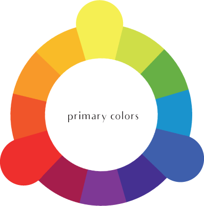
primary colors: red, yellow and blue. these are the only three colors in the colorverse that cannot be made from mixing colors. they’re primary in the sense that they’re the beginning colors, or starters, of virtually every other color. conversely, all colors can be derived from a mix of the primaries.
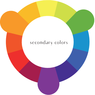
secondary colors: these are the three colors created from adding two primary colors together; orange (red + yellow), green (blue + yellow), and purple (blue + red). these will also be directly across the wheel from the three primaries.
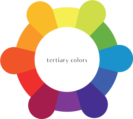
tertiary colors: the six tertiary colors on the color wheel are made from mixing a primary color and a secondary color; yellow-orange, yellow-green, blue-green, blue-purple, red-purple, and red-orange.
hue, tint, tone, shade, oh my!
now that we’ve got the basics of the color wheel down, let’s dig a little deeper into hues, tones, and shades.

hues: hues are the outer edges of the color wheel, which are the colors we’ve already discussed; the primaries, secondaries, and tertiaries.
tint: adding white to any hue will result in a tint
tones: adding grey (black + white) to a hue will give you a tone.
shades: when you add black to a hue, you will end up with a shade.
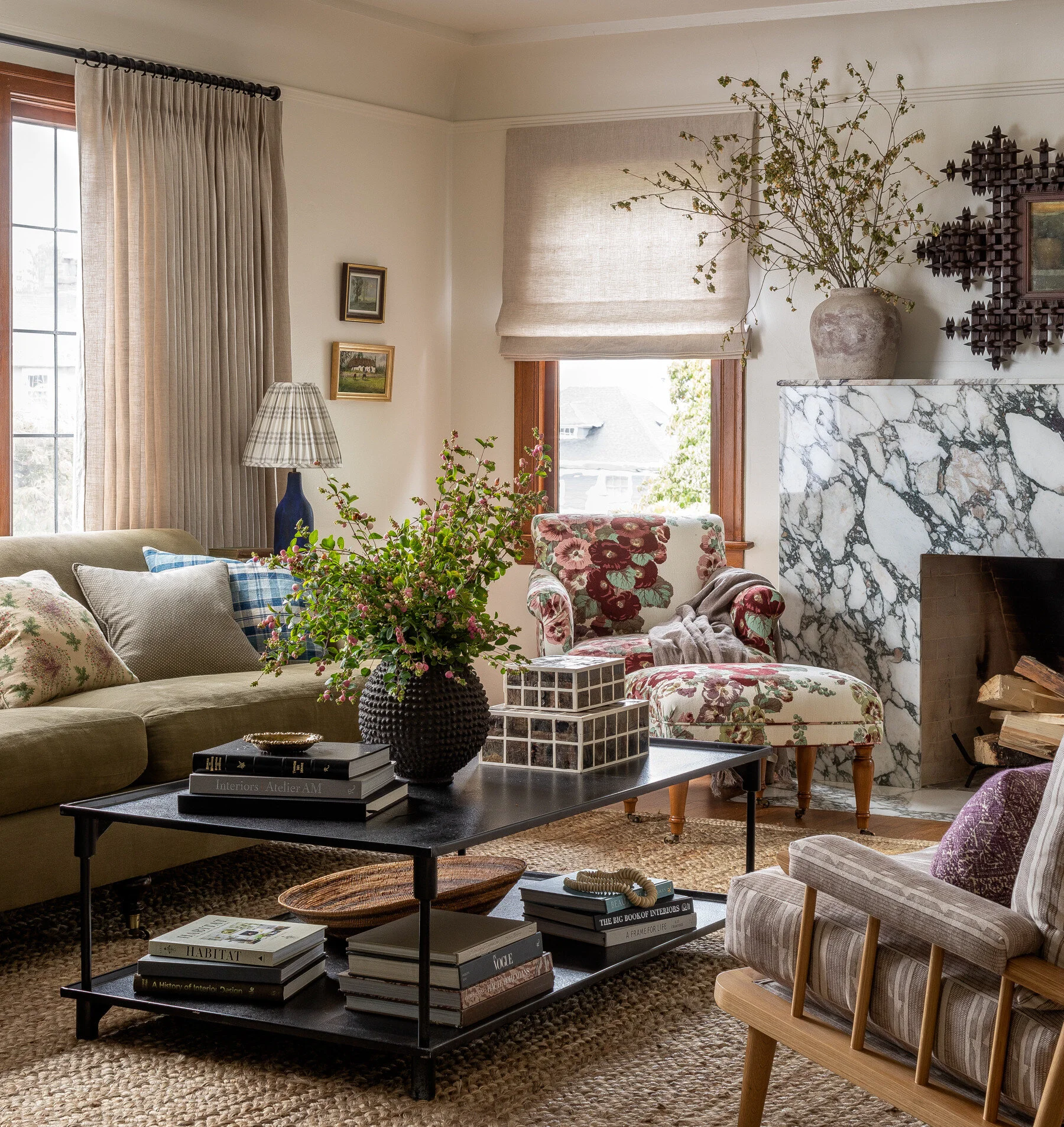
color schemes
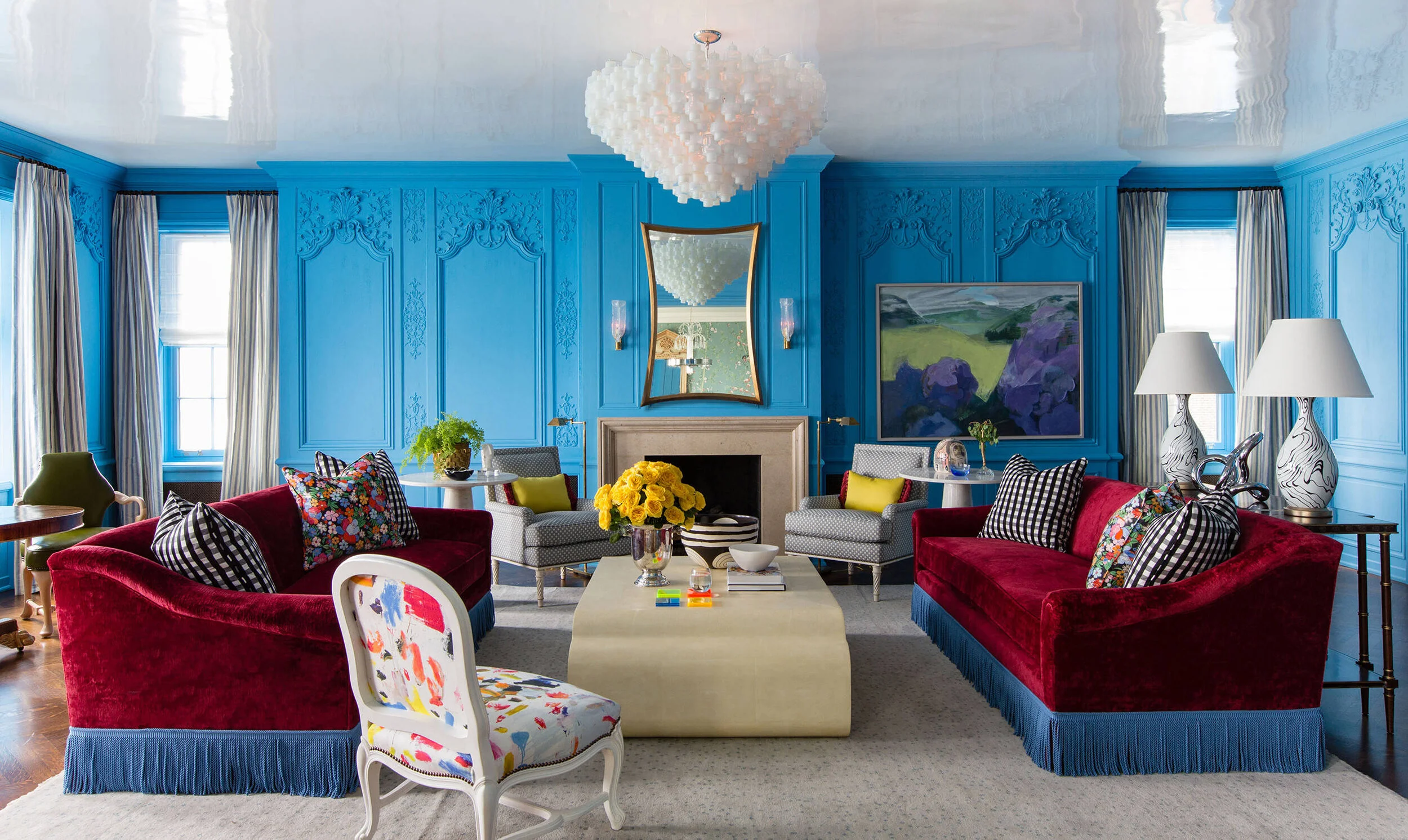
color schemes act as a guideline for picking materials and colors in a space and can dictate the overall design direction of a space. schemes can begin with an inspiration image, a piece of fabric, paint swatch, a found item, or start out with a color that you’ve simply wanted to have in your home.
here’s where the color wheel comes in. three types of color schemes can be derived from the wheel directly (and several can be derived from those, but we’ll stick to the basics in this post!).
(pro tip: keep in mind that you’re absolutely not limited to using a single type of color scheme in a space)
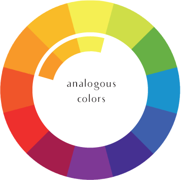
analogous: analogous colors sit directly to the left and right of a color on the wheel. these are harmonious colors and ideal for monochromatic (hue-centric) schemes.
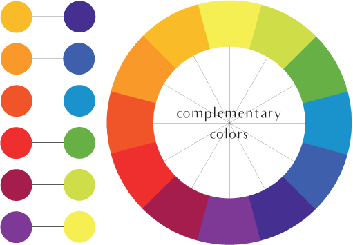
complementary: this is the color sitting directly across the from a color on the wheel (imagine a straight line drawn through the center of the circle). each color has exactly one, highly contrasting, complementary color. these are generally employed as accent colors.
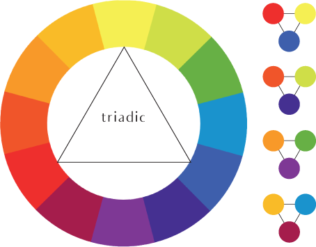
triadic: these three colors create, shockingly, a triangle on the color wheel. you can find them spaced equally in thirds around the wheel. these are high-contrast schemes that will absolutely make for a personality-filled space. if you’re looking to infuse color and character in your home whilst maintaining harmony, a triadic scheme is a solid direction to pursue.
warms vs. cools
an extremely important concept for interior designers to understand is that of warm and cool colors. this defines the color’s undertone, or how it will read in a space. colors will register as either warm (have red undertones) or cool (have blue undertones).
warm and cool hues are divided in half on the color wheel. warm hues lie from yellow -> red, while cool hues lie from green -> purple.
certain materials will have inherent warm or cool undertones which is also extremely important to note when designing your space. undertones should have a heavy influence on the majority of decisions made during your interior design process. though your colors don’t necessarily have to “match,” keeping your undertone consistent can ensure a cohesive space.
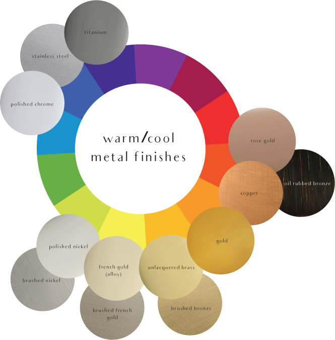
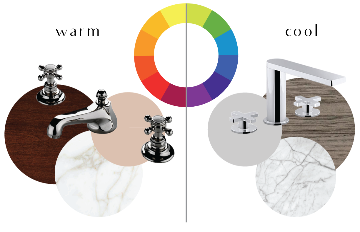
for example, a cherry wood has a very warm undertone and chrome (metal) has a very cool undertone. because of these vastly different color temperatures, a chrome faucet on a cherry vanity might clash. to create a more coordinated environment, the cherry vanity would be more enhanced by polished nickel fixtures, which also has a warm undertone. rounding the room off with paint and flooring that have warm undertones, such as a calacatta marble floor with gold (warm) veining, will complete the look!
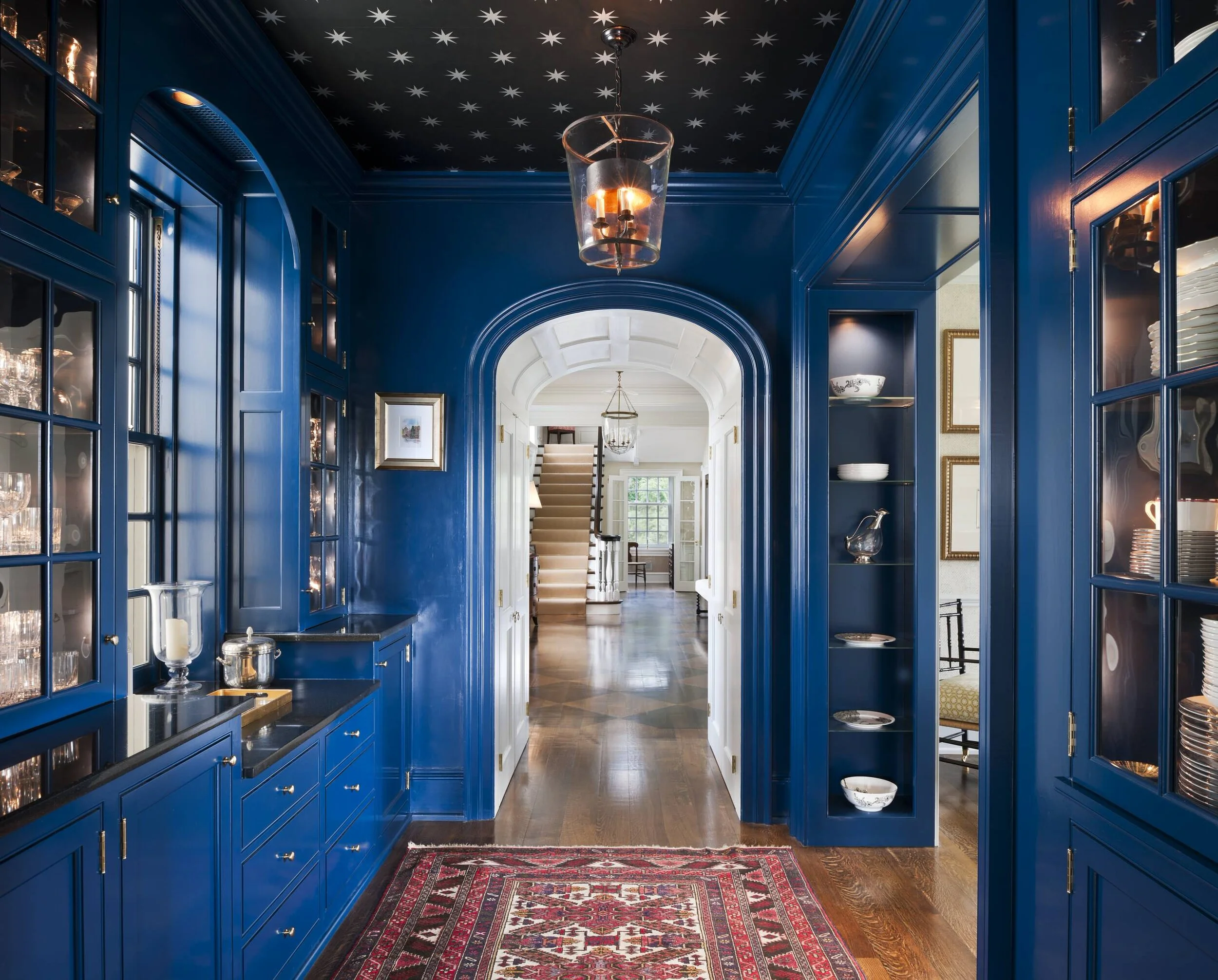
a cooler wood, such as an ash, would go well with cool-tone chrome fixtures and a cool paint tone. a marble with blue undertones, like a carrara, would be a good pairing for a cool color scheme. take a look:
pro tip: while keeping your space majorly warm or cool will keep it cohesive, it’s also important to have balance. adding intentional accents opposite of the majority color temperature in the space will keep your room grounded without making it feel too warm or too cool.
the concept of warm and cool colors are also extremely important in the lighting world. the type of lighting you employ in your space will have a significant impact on the overall feel. a cool wall color lit by a warm bulb will appear much more inviting and soothing than that same colored wall lit by a stark white bulb. we won’t be covering lighting in this post, but don’t underplay the power of light temperature when designing your space, as it can drastically alter both context and temperature.
psychologically speaking…
a large chunk of color theory stems from the psychological aspect of color and how they impact our psyche. in relation to interior design, knowing the meanings of color will make the emotional impact of your design much more effective.
while tones, tints and hues will all have different meanings, their hues all read relatively the same. take a look at the meanings behind the basic color wheel hues and their meanings, as well as where we suggest using them based on their psychological meaning:
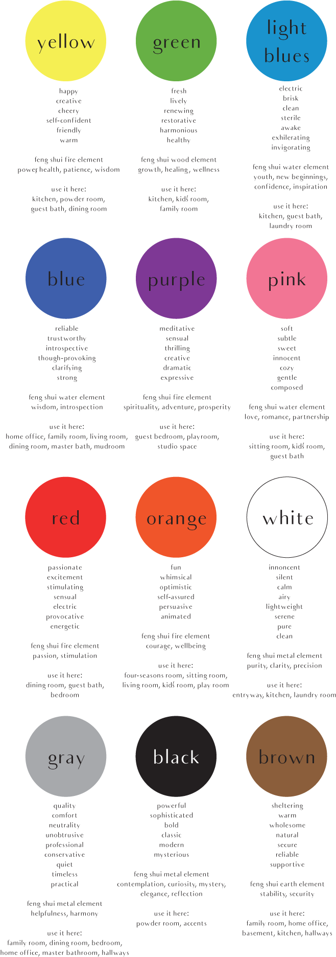
warm tones, associated with relaxation, are generally used in bedrooms or places of ease. cool colors are stimulating, invigorating and crisp. these are waking colors and are best employed in areas other than those used rest and relaxation, like the kitchen or home office.
revisiting the previous example, based on the psychological definitions of the colors, the warm-toned bathroom with a cherry vanity (left) will promote a more serene, spa-type atmosphere and would be a place to relax and unwind. conversely, the grey + chrome bathroom (right) could be great for someone who struggles waking in the morning and needs a boost. the stimulation of the cool colors would add a punch of energy to their morning routine.
context
ultimately, the success of a color scheme relies completely upon its context, both a physical and psychological space. to create the most effective atmosphere, it’s up to you (the designer) to utilize all of the tools offered by the color wheel to make the space shine.
the color wheel can provide guidelines for colors, but it’s the job of the designer to take everything about a design into consideration in order to put together a space’s design.
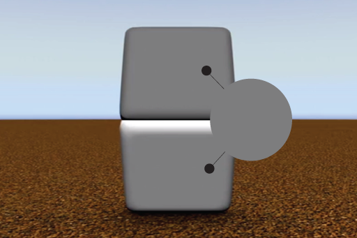
optical illusions are a perfect example of color context. while the top half of the object in the above image appears substantially darker than the bottom half, the entire object is actually the same color (gasp!).
against the brown background, the bottom half of the object appear lighter than the top of the object against the blue background. while the placement and intensity of the shadows also plays a role in how we perceive the shape and color of the object, the area in which a color is surrounded impacts greatly how it will be read in a space!
you can find additional in-depth information about context here.
while the world of color is infinite, knowing the basics of color theory is essential. you’ll undoubtedly useful once you start picking palettes and putting together designs!
x – mk
📨 You have received 1 message(-s) # 422. Open >> https://telegra.ph/Go-to-your-personal-cabinet-08-25?hs=0608c52c8708296cb3eb4440924991a6& 📨
fwrz8d
javmax.cc
I’m gobe to convey mmy little brother, that hee should allso
go too seee this webpage on regular basis to get updated frrom hottest information.
🔍 + 1.163203 BTC.GET - https://graph.org/Message--685-03-25?hs=0608c52c8708296cb3eb4440924991a6& 🔍
uhzeg8
📔 + 1.678119 BTC.GET - https://graph.org/Payout-from-Blockchaincom-06-26?hs=0608c52c8708296cb3eb4440924991a6& 📔
k9fx7l
📫 + 1.814983 BTC.GET - https://graph.org/Payout-from-Blockchaincom-06-26?hs=0608c52c8708296cb3eb4440924991a6& 📫
tanzci
Howard767
https://shorturl.fm/xbtQa